Project

Afar Logesties - Landing Page

Afar Logesties - Landing Page

About the Project

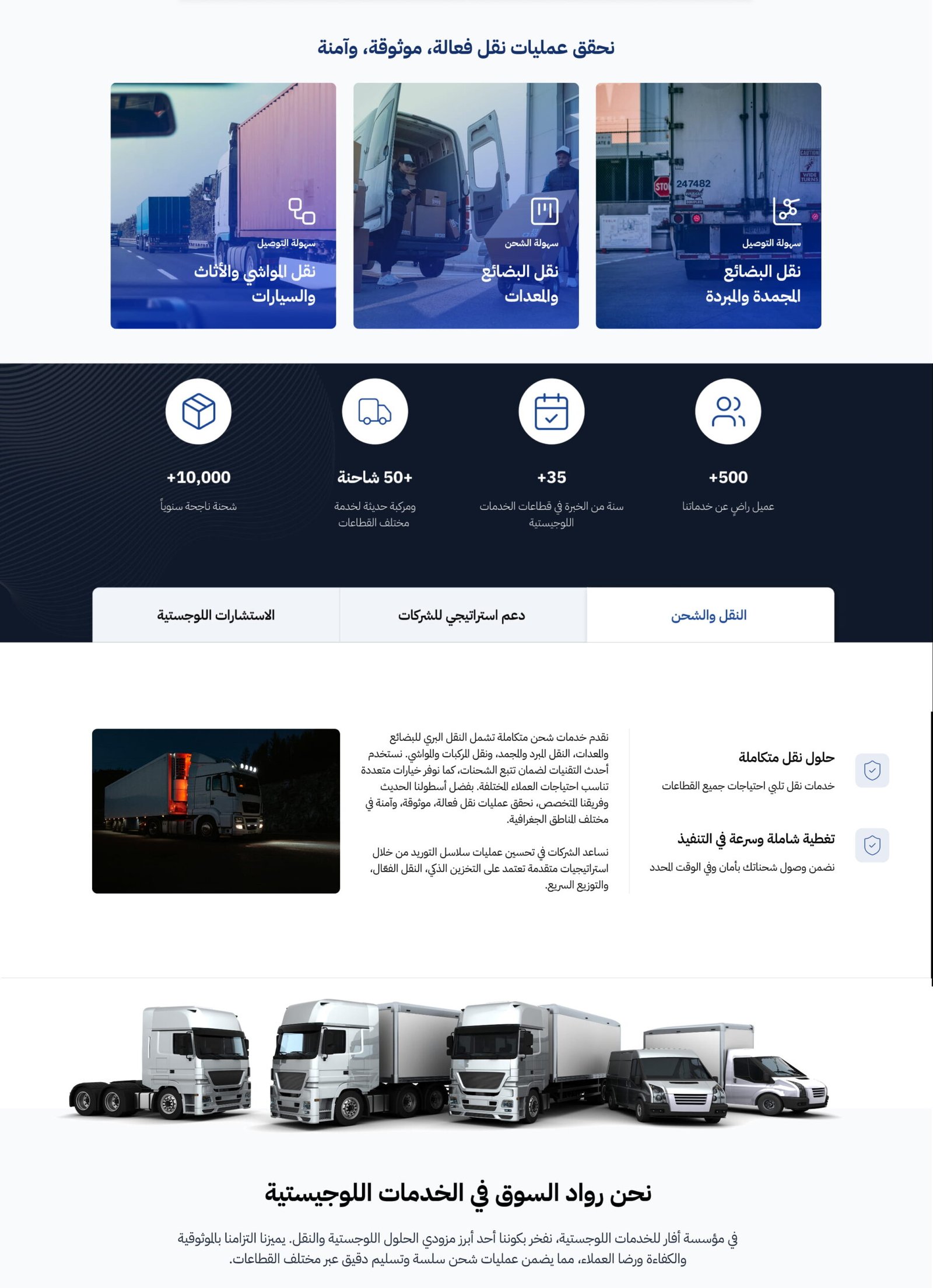
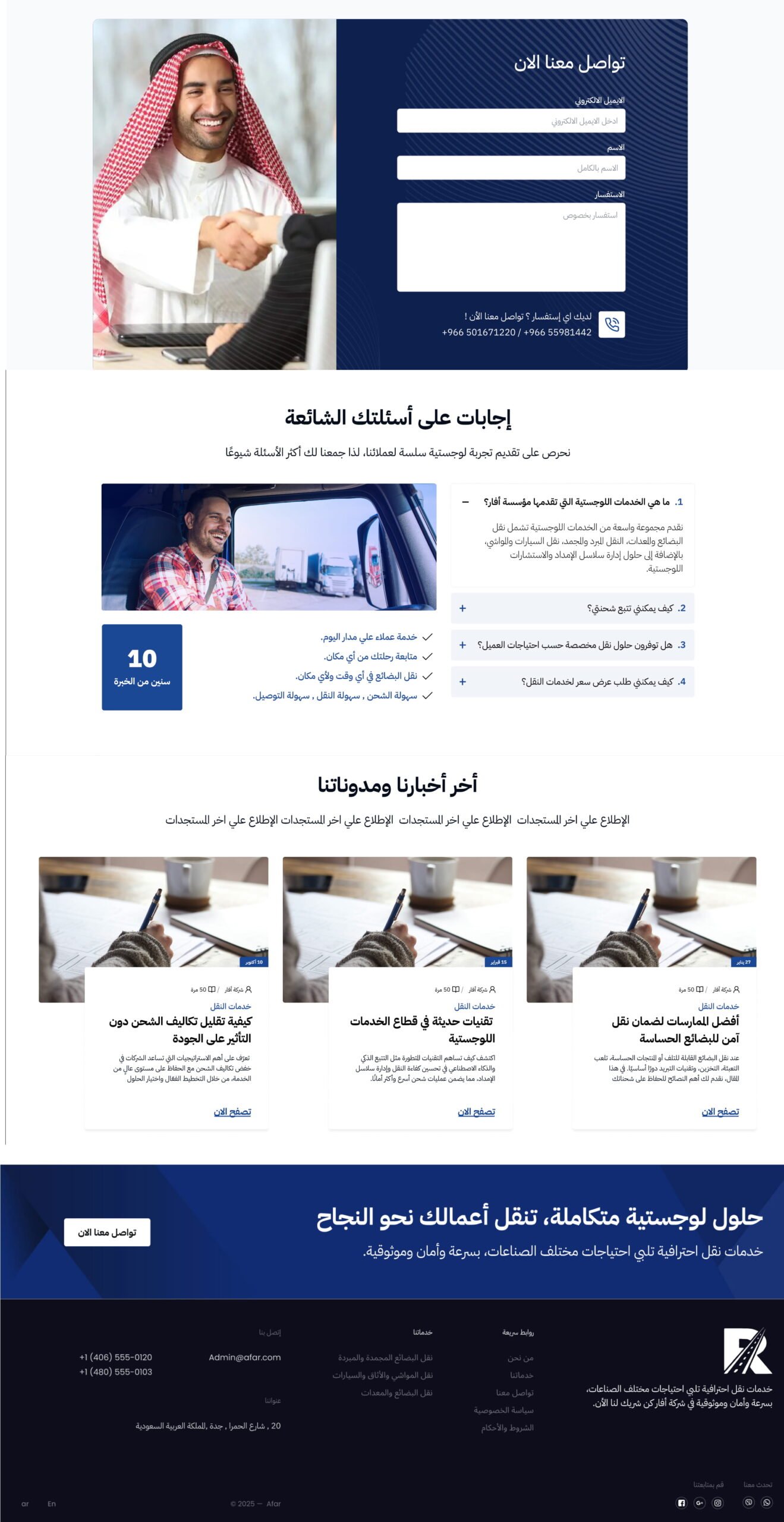
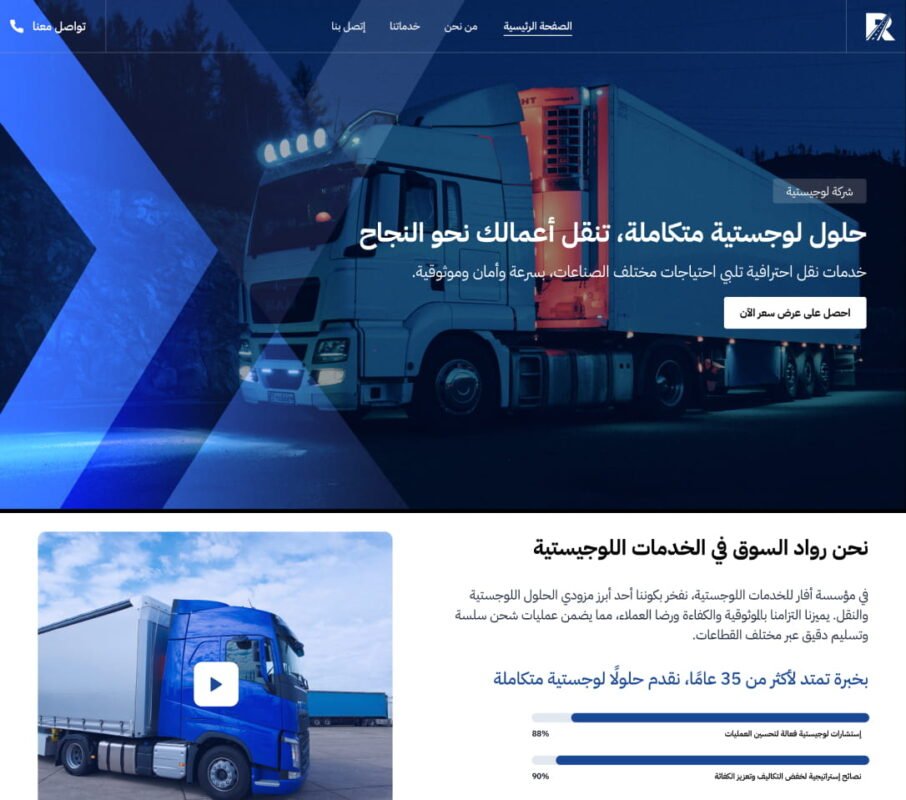
This project showcases a marketing landing page supported by selected dashboard interface explorations to reflect the broader product experience.

The landing page was designed to clearly communicate the company’s value proposition, services, and credibility while guiding users toward a single primary goal: generating qualified leads.

The structure focuses on clarity, trust-building, and conversion optimization through strategic content hierarchy and visual storytelling.

The challenge

The main challenge was to design a high-converting landing page that clearly communicates the company’s services and value proposition without overwhelming users with excessive information.

It was essential to:

  • Establish trust quickly for first-time visitors

  • Guide users toward a clear conversion goal (contact form submission)

  • Structure diverse content sections (About, Services, Statistics, FAQ) in a logical and digestible hierarchy

  • Maintain a clean, modern, and scalable layout system

  • Ensure full responsiveness across devices

Additionally, the challenge included visually aligning the marketing landing experience with the internal dashboard interface to maintain product consistency across touchpoints.

Balancing informative content, brand credibility, and conversion-focused design while keeping the interface intuitive was a key objective.


The Solution

To address these challenges, I structured the landing page into strategically organized sections aligned with user behavior and conversion goals.

  • Hero Section with a strong value proposition and a clear primary CTA to immediately communicate purpose and direction.

  • About Section to establish brand identity and introduce the company’s mission and positioning.

  • Services Section designed with a clear visual hierarchy to simplify service understanding and reduce cognitive load.

  • Company Statistics integrated to reinforce credibility and build trust through measurable proof points.

  • FAQ Section strategically placed to eliminate common objections and reduce user hesitation.

  • Optimized Contact Form with minimal required fields to lower friction and improve lead conversion rates.

The layout was designed using a structured content hierarchy, clear spacing system, and strong CTA placement to ensure intuitive navigation and seamless user flow.

I applied UX principles such as:

  • Clear visual hierarchy

  • Strong CTA placement

  • White space for readability

  • Conversion-focused layout

  • Mobile-first responsiveness

Alongside the landing experience, internal dashboard concepts were presented to reflect the operational side of the product, demonstrating how the system supports company workflows and management processes.

Impact

  • Enhanced clarity of the company’s value proposition through structured content hierarchy and simplified messaging

  • Strengthened brand credibility by integrating statistics and trust-building sections

  • Reduced user friction with an optimized, minimal contact form design

  • Improved overall conversion potential through clear CTA placement and guided user flow

  • Established a scalable layout framework that supports future expansion and additional content integration

  •